Illustration and Visual Narrative | Task 1
Name: Isaac Yaw Wai Zac (0343197)
Course: Bachelor of Engineering (Hons) Mechanical Engineering
Module: Illustration and Visual Narrative // Ms. Noranis & Ms. Jennifer
Task 1(Vormator Challenge)
In the very first week itself, Ms. Anis and Ms. Jennifer introduced the first task and needed all of us to come out with our own character design in sketch form to then be introduced into digital design form. However, the task was made even more challenging when we are only allowed to use the few given shapes as shown in Figure 1.1 below.
Figure 1.1: Elements/Shapes to build the character (27th August 2021)
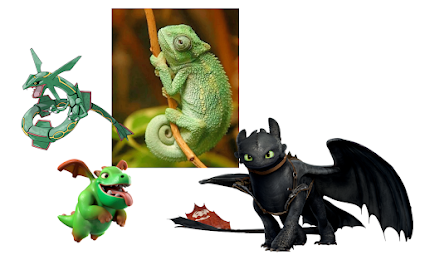
I managed to research online and found a few animated characters which I like and maybe merge them together to create a new creature or hero. My favourite character is Rayquaza from Pokemon and other than that, I thought of merging the cute elements from a dragon and a chameleon because they are all considered to be reptiles and can fit together really nicely.
Figure 1.2: My inspirations for the character (28th August 2021)
After a few drafts and physical sketches, I went with an overall cute character design because all the 3 creatures as shown in Figure 1.2 are relatively scary if they were not made into cute animated characters. My initial sketch is as shown in Figure 1.3 and then was further detailed in the Adobe Illustrator software in the second week. This is because the software was only taught in the second week.
Figure 1.3: Initial sketch design (as of 28th August 2021)
Figure 1.4: Drawing in Adobe Illustrator software (as of 3rd September 2021)
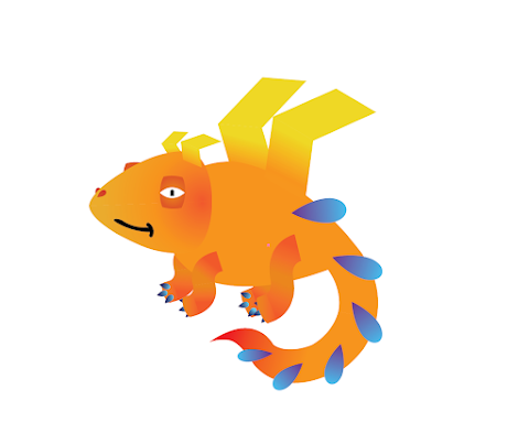
Figure 1.5: Bubba character (as of 3rd September 2021)
Throughout the second week, the background and layout of the card were explored and the selected theme is inspired by the Pokemon card game. However, I thought of tweaking my character whilst sketching and designing my card layout as I still have time this week to finalise my character and because I did not like the outcome of the 'Bubba' character as shown in Figure 1.5 above. The 'Bubba' character seemed to be a little sleepy and can be further improved in the details and its facial expression. Figures 1.6 below shows the process of sketching my updated character and I will name my character 'Galactic Dragon'. Then, this updated character design was brought into Adobe Illustrator and was animated.
Figure 1.6: Sketch progress for 'Galactic Dragon' game card (as of 4th September 2021)
Figure 1.7: 'Galactic Dragon' character progress in Adobe Illustrator (as of 4th September 2021)
Figure 1.8: 'Galactic Dragon' Progress in digital form (as of 4th September 2021)
Figure 1.9: First draft of 'Galactic Dragon' (as of 4th September 2021)
Although this design is just the first draft and is not finalised at this point in week 3, I had already started the game card layout and design sketches because I am already very happy with how my character turned out in the first draft, but there can still be room for improvement in the upcoming weeks. Since this is a continuous blog/e-portfolio that will constantly be updated, I will document the upcoming progress(s) in the Exercise 2 section below until I reach the final character design as shown in Figure 1.10 below.
Figure 1.10: Final design of 'Galactic Dragon' (24th September)
View here: Link
Task 1 (Exercise 2-Game Card)
About the card design for this character, I got my inspiration from the NFT designs and also top tokens which have the graphic designs as shown in Figures 2.1 to 2.3 below. These NFTs or tokens are essentially digitalised artwork or character designs that can be owned through cryptocurrency. I like the examples taken here because they are more of the galactic or minimalistic themed card designs.
Figure 2.1: Card design inspiration (as of 4th September 2021)
Figure 2.2: Card design inspiration (as of 4th September 2021)
Figure 2.3: Card design inspiration (as of 4th September 2021)
Figure 2.4: 'Galactic Dragon' card design - sketch (as of 4th September 2021)
Before creating the card in digital format, I had to take this opportunity to make myself a personal logo to represent the branding of my card design. I initially had my own logo design already as shown in the video down below that I created using the SolidWorks software. Then, I took screenshots of it in 2-dimensional form so that I can trace it using the Adobe Illustrator software. This personal logo does not have any specific story or meaning behind it, because it is designed based on the initials of my name and I think that it will be a very good opportunity to integrate and implement this logo design as the game card logo.
Figure 2.5: My personal logo design (as of 10th September 2021)
Figure 2.6: Logo design to be digitalised and used in the card design (as of 10th September 2021)
Then, the sketch of the card design was inserted into the Adobe Illustrator software to see whether the layout or the composition of the card would look nice when animated. The figures down below show the progress of making the card design using the Galactic Dragon design which I have already created previously as shown in Figure 1.9 above. Although that is not the finalised design, I just kept on using it for now to see the composition of the card and how it would look when completed.
Figure 2.7: Progress in digitising the card design in Adobe Illustrator (as of 10th September 2021)
Figure 2.8: Progress in digitising the card design with character (as of 10th September 2021)
Figure 2.9: Adding new elements to the Galactic Dragon character (as of 12th September 2021)
Video progress in making changes and adding new elements to the 'Galactic Drgaon' character
(as of 12th September 2021)
Figure 2.10: Progress in digitising the card design with new character (as of 12th September 2021)
Figure 2.11: First draft of the card design with character (as of 12th September 2021)
In the 4th week of the Illustration and Virtual Narrative class session, some feedbacks were given from both our lecturers, Miss Noranis and Miss Jennifer. From the updates up to this date as shown in Figure 2.11 above, Miss Noranis mentioned that I will need to make quite a few changes. The first thing is that all the font types must be changed because they do not fit together well nor fit the theme of a game card design. Other than that, all the colouration or colours chosen on the front side of the card do not match one another nor are analogous. To make changes to that mistake/problem, I then proceeded to try out different layouts of the front card together with different colours so that the ugly-looking frames in purple and in black as shown in Figure 2.11 above can be eliminated. Other than that, she also mentioned that all the yellow elements in the planet ring should be changed because they do not fit in well and are not appealing to be viewed. After all the feedbacks given and considered, I decided to remove all the chunky looking blocks to try out a simpler design and also proceeding with the back side of the card. All the progress are documented below.
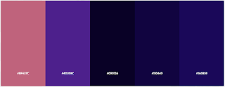
Figure 2.12: Colour theme exploration for overall card colour theme (Adobe Colour Wheel)
(as of 18th September 2021)
Figures 2.13, 2.14, & 2.15: Colour wheels chosen for both front and back of the card
(as of 18th September 2021)
In terms of choosing the colour theme/scheme, there is no specific reasoning for this because I just want the card to fit the galaxy/galactic theme. Therefore, Figure 2.13 (first colour palette) was chosen for the front side of the card in which the character is. Another reason for this is because my character is in a relatively bright colour scheme and to allow it to stand out, the background of the front card must make good use of colours that fit the galactic theme and should not stand out as much as the character itself. On the back side of the card, the colour wheels from Figures 2.14 & 2.15 were chosen because the black and gold/yellow theme fit very well with the galactic theme which is visually appealing when placed side by side to the front side of the card. It also represents the shooting stars in the galaxy.
Figure 2.17: Progress of card design with a new and simpler minimalistic design
(as of 18th September 2021)
Figure 2.18: Testing out different planet designs (as of 18th September 2021)
Figure 2.19: Progress in trying out different colours and layouts for the back side of the card
(as of 18th September 2021)
Figure 2.20: Card design (second draft) (as of 18th September 2021)
At this point, I have already gotten my second draft done for both the character and card design. In Figure 2.20 shown above (second draft), I am very happy with how it turned out because it matches the overall galaxy or galactic theme I initially went with. The colouration, elements layout, character design are matching very well and it has a good visual hierarchy on both sides of the card. The framing in terms of the rule of thirds and also the golden ratio rule is followed. However, before the final submission, I would like to make some slight changes to the card design and character design because I still see some minor things that can be further improved on. Some of these include misalignment of elements, positioning some elements, and making the Galactic Dragon character fit in better with the background planet.
However, in week 5, I realised that one of the rules under this task states that the given Vormator shapes can be modified but not distorted, which I did in most of the parts of my character design. I distorted the teardrop shape in the body feathers and the wings so that they appear to be longer to resemble feather-like elements. Therefore, I had to immediately change my character design once again or remain the same design but with the un-distorted shapes/elements. As shown in Figure 2.21 below, I played around with many different wings design to then select the best one. After quite a lot of attempts, I finally went with the similar long teardrop shape through the pathfinder tool that can allow overlapped shapes to cut/delete the region underneath it. Then, I am done with the design and the final design is shown below.
Figure 2.21: Testing out different wings compositions (as of 24th September 2021)
Figure 2.22: Progress of the front side of the card (as of 24th September 2021)
Figure 2.23: Progress of the back side of the card (as of 24th September 2021)
Game card documentation: Link
Figures 2.24 & 2.25: Final Game Card design (24th September 2021)
View in Google Drive:
Character - Link
Card (front) - Link
Card (back) - Link
Card description:
The idea of this game card design is that it is a very rare collectable of a variety of galaxy/galactic cards and hence, the name of the card game ('GALACTIC CARDS'). If I were to make a whole collection of these cards, I would love to have Galactic Phoenix, Galactic Scorpion, Galactic Lizard, Galactic Beast, and etc.
At the back side of the card, it is already in galactic theme and I integrated a lot of elements that resemble star signs/constellations to represent each category of each character. For this character, it is in the triangular logo group as the logo can be seen at both top sides of the front side of the card. (I will name this group the Krypton) Right in the centre of the back side, we can see the custom ZAC logo which is a representation of my initials and can represent the company that made these cards. In terms of visual hierarchy, viewers will see the big logo first and then will slowly be diverted to all the elements like star signs and planets around it because of the 4 pointy yellow elements which represent shining or shooting stars towards all 4 corners of the card.
In the front end of the card, a huge planet is used to represent this category of Krypton in which the Galactic Dragon is in. Therefore, different card types/categories will be represented by different colour planets. However, the colour of the planet did not stand out because of visual hierarchy and this will allow the character to be the biggest and the main focus of the card. In the sequence of visual hierarchy, viewers can then either continue viewing to the top side or the bottom side because there are other important elements there. If the top side is viewed, viewers get to see the name of the character and a short description of it about its ability/power. If they decided to view to the bottom side, they get to see its hit points (HP) and also its rarity which is illustrated by the numbers of stars/medals in yellowish gold. These medals represent the rarity of this card.
Week 1 (feedback) - In this week, task one was introduced and we were all assigned to create our own characters to be further developed in the upcoming weeks. However, there were a few specific rules to follow in which the characters must only be constructed using the Vormator shapes given. There are no limits in what Vormator shapes to use now the quantity so it is fully based on our creativity which made it very fun and interesting. In this week, only a
Week 1 (reflection) - It was a very interesting week because I get to finally expose myself in the art/creative media side in terms of education because I took this module as one of my Minor modules to learn something new (from Engineering school).
Week 2 (feedback) - In this week, only a few students came up with their progress on their character designs and I did not consult to obtain feedbacks because I did not have a chosen character at this point yet. However, I chose to create some sort of flying creature like a phoenix or a dragon after seeing and getting inspired by the progress of my peers/classmates.
Week 2 (reflection) - It was a very challenging week for me personally because I do not have experience in using design software such as Adobe Illustrator. it took me quite a long time to learn and fiddle around on my own to use different tools. The software interface is overwhelming but i was very happy because Miss Jennifer taught us in the tutorial session and demonstrated the essential tools needed to create our character.
Week 3 (feedback) - In this week, I already had my first progress done which can be seen in the progress documentation in the above section (Figure 1.5). In the consultation session, Miss Jennifer advised me to play around and try out different facial expressions for my dragon character because it does not look visually appealing at this point. Miss Noranis also agreed with Miss Jennifer and also advised me to try out different shapes/compositions for the wings because they looked too 'boxy' with very sharp corners.
Week 3 (reflection) - This was an interesting week because I am still very new to the Adobe Illustrator software in creating my character. Then, our lecturers introduces us to the second part of this task, which is to use our character design to be used in a game cards design. I had to 'kill two birds with one stone' to try my best to complete as much progress as I can before week 4's consultation so that I can finalise both my character and card design(s).
Week 4 (feedback) - In this week, Miss Jennifer and Miss Noranis mentioned that they like my current progress and design of the character together with the layout of the game card. For the character, I should use a better way to demonstrate/integrate the gradient feature because the wings looked to be connected flush to the body of the dragon, and should be visually seen to be separated. Other than that, the colouration of the card design should be changed because they looked too harsh and do not match very well. The fonts in the card must be changed too because they do not look nice and do not match the theme.
Week 4 (reflection) - I was very happy with the progress and feedbacks from both my lecturers because this task is both challenging and fun to be made. All the positive feedbacks and ideas gave me the motivation to further work on and complete task 1 before the submission deadline and also being satisfied with the outcome.
Week 5 (feedback) - This week is the week for task 1's submission and I was done with the submission and attended the consultation session during class to receive the final feedbacks if any changes should be made. I was not very happy with the wings design of my character because I realised that the Vormator shapes cannot be distorted one day before the submission day and I had to redo most of the parts of my character. In the consultation session, Miss Noranis suggested that I could keep the feather-wings concept design for my character but with better compositions. After further trial and error, and final tweaking, I managed to finish the wings and was satisfied with the outcome.


Comments
Post a Comment