Illustration and Visual Narrative | Lectures and Practicals
27th August 2021 - 26th November 2021 / Week 1 - Week 14
Name: Isaac Yaw Wai Zac (0343197)
Course: Bachelor of Engineering (Hons) Mechanical Engineering
Module: Illustration and Visual Narrative // Ms. Noranis & Ms. Jennifer
Name: Isaac Yaw Wai Zac (0343197)
Course: Bachelor of Engineering (Hons) Mechanical Engineering
Module: Illustration and Visual Narrative // Ms. Noranis & Ms. Jennifer
Figure 1.1: Week 1's class (27th August 2021)
In this week's lecture, the class session was conducted through 'zoom' and was conducted by both our lecturers, Ms. Noranis and Ms. Jennifer. It was a relatively quick session that only took up a little over 2 hours and we managed to cover the introductory of this module which includes the module information booklet (MIB), study materials, and showing some insides with the help of a few seniors' work so that we can get ourselves more prepared for the upcoming tasks. The session was concluded with the briefing of the first task (The Vormator Challenge).
Shape defines a character's silhouette. This also allows us to identify a character from one another and making it iconic to stand out from the others.
Colour plays an important role and can help readers/viewers to identify the protagonists or antagonists. The impression of a character can also be determined with the help of colours by changing the emotions in the form of colour psychology.
Emphasis & Contrast can be used to make a certain character or subject outstanding and memorable such as by making the colour stand out, using bigger size, or by adding elements.
Harmony is important to allow all shapes, lines, colour, motifs, patterns to fit together in a tasteful manner. In which they must all complement one another in terms of use of shapes, sizes, and making good use of analogous colours. Not to forget, a good balance of visual elements has a good visual hierarchy.
Expression is important because it is a representation of our character because it is visually shown in all characters as a first impression. This will win the hearts of viewers/audiences by fonding the characters' behavior/quirk/personalities through the expression aspect.
Figure 1.2: Examples of good character design references
Figure 1.3: Examples of good character designs
Week 2
Figure 2.1: Week 2's class (3rd September 2021)
In this week's class, the tutorial session was conducted first by Ms. Jennifer and all the basics together with examples were demonstrated with the Adobe Illustrator software. After that, the lecture session was conducted by Ms. Anis and then the practical session was done by viewing each of the student's current progress on the Vormator Challenge (Task 10) and a lot of feedbacks were given to allow changes to be made to then come back in the following week with the complete digitalised character for this task.
In this week's lecture session, we learned about the use of illusion in spaces and the term learned is 'Chiaroscuro', which refers to the use of light and dark spaces to create an illusion effect which could be in the form of a 3-dimensional effect on a flat surface.
The 'Chiaroscuro' feature/effect is used to increase dramatic tension in scenes, create sensational effect, bring attention to a subject in an intense way, and making good use of the positive and negative spaces.
Week 3
Figure 3.1: Week 3's lecture session (10th September 2021)
Figure 3.2: Week 3's tutorial session (10th September 2021)
In week 3's class session, we went through the lecture session which covers the topic of composition in artwork, films, and pictures. Both our lecturers, Miss Noranis and Miss Jennifer also went through our task 1 progress to then give individual feedback for us to further work on so that we are on the right track and are constantly working on our character and game card design (task 1) will be due in week 5. In the tutorial session, Miss Jennifer further demonstrate the use of new features such as mirroring, duplicating, adding gradients, combining shapes, and cutting shapes in the Adobe Illustrator software. To further demonstrate this, she showed us how she used all these features onto her character named Kemmy.
Figure 3.3: Illustration of well-composed pictures (from Instagram)
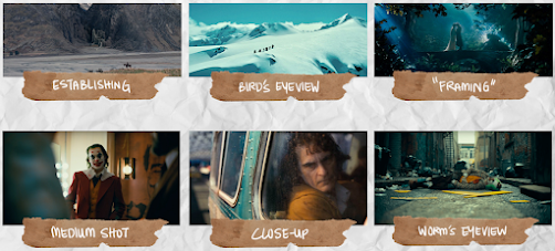
Under the composition topic, it is relatively subjective because different people view things differently such as the visual hierarchy or things that stand out to them at first glance when viewing a composition. However, there are specific types of shots/compositions that are commonly used in movies as shown in Figure 3.4 below.
Figure 3.5: Demonstration of good use of positive and negative spaces
Figure 3.6: Demonstration of the use of positive and negative spaces in pictures taken from Instagram
Figure 3.7: Demonstration of visual hierarchy in famous movie scenes
Week 4
In week 4's class session, the session was a very interesting one because we get to the finalised/close to finalised character and game card designs from all the students in the consultation session. In the lecture session, Miss Noranis taught us the second part of 'COMPOSITION' which covers the use of perspectives in famous and renowned artworks. In the tutorial session, Miss Jennifer demonstrated and taught us how to use some extra tools in the Adobe Illustrator software by creating a background design for her chameleon (Kemmy) to be used in the game card design.
Figure 4.2: Good representation of perspectives in 'The Last Supper' artwork
Figure 4.3: Good representation of perspectives in 'The School of Athens' artwork
The artwork shown above does not just have a good visual perspective that leads us to the focused subject at the contact points of the perspective lines, but also having a very intriguing visual hierarchy because they are too many things going on, in terms of the attention to details. For example, some of the characters in the artwork are looking back at us and some are not. Other than that, there are different colours represented by the clothing worn by each individual to attract the viewer's attention and focus. Not to forget that there are many small elements or attention to detail such as the 2 paintings in the background that represent two other famous paintings.

Figure 4.4: Example of 1 point perspective
Figure 4.5: Example of 2 point perspective
Figure 4.8: Demonstration of using foreground, middle ground, and background
Extra notes
Week 5
In this week's class session, the final consultation session was done for our task one because the submission deadline is due the same day. In the lecture session, Miss Noranis went through the third part of the composition topic. This time, we ventured into the rhythm and movement topics. In the tutorial session, Miss Jennifer demonstrated the poster design of the movie 'IT' to allow us to get insides and also to kickstart our task 2 for consultation in the following week.
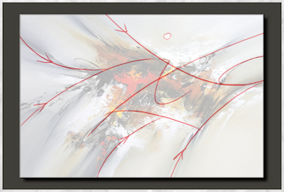
Having rhythm in art is one of the most difficult aspects to achieve and to put it into a different context, good music means having a good beat, and to have a good beat, we need to have a good rhythm. On the other hand, we can use shapes and lines to create movements. To make a visual composition more interesting, we need to maximise overlapping elements.
Figures 5.2 & 5.3: Demonstration of movement in compositions (through breakdown)
Week 7
In this week's class session, we went through the topic of 3-Acts Structure during the lecture session. Then, we proceeded with the consultation session for our task 2 - The decisive Moment poster. In this week, most of us were almost done and we're finalising our poster designs so that we can prepare ourselves in the upcoming week for the animation of the Decisive Moment poster. Then, Miss Jennifer demonstrated how to use the timeline tool in Adobe Photoshop to prepare all of us for the upcoming stage of animating our posters for the Decisive Moment task.
Under the storytelling basics, there are many aspects to look into:
Central theme:
The theme is the general overview of what the story I really about. With a good and well-planned theme, a very good story can be delivered. A story can have major and minor themes altogether.
Major theme - idea that is intertwined and is repeated throughout the whole narrative.
Minor theme - idea that is not significant and is not repeated.
Conflict:
With good suspense and variation, we get to gain interest from viewers or listeners when there is conflict in the story. There would not be any compelling stories to be delivered if there is no conflict along with the storyline. It will instead be very dull and boring.
Characters:
A story must have a number of characters that are in variety so that they each play different roles and purposes. Most of the time, there is a protagonist and antagonist.
Central character - the plot always revolves around this character
Protagonist - this is the main character of the story and has a clear goal to accomplish or a conflict to overcome
Antagonist - they normally oppose protagonists and can be represented in the form of any person, place, thing, or situation.
Three-Acts Structure:
Setup - this is the location or setting in which the protagonist exists prior to the journey.
Rising Tension - the obstacles which the protagonist must overcome and the obstacles are usually more difficult than one another. This will create a more suspenseful and interesting plot for the story.
Conflict - with this, tension can be created and are often the turning point for the protagonist.
Figure 7.1: An overview of three-act structure
Act 2 (Conflict) - rising action, midpoint, plot point two
Act 3 (Resolution) - pre climax, climax, denouement
In this week, both our lecturers also gave us a new task to get ourselves going for the upcoming task. As for our homework, we were assigned to prepare a short and interesting story in just about 300 words whilst utilising the three acts structure as well. My full story and documentation are documented in the Task 3 post here.
Week 8
This is a self-learning week and therefore, there were no class sessions conducted.
Week 9
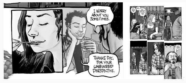
Transitions! Transition is so important when it comes to storytelling because a story with good flow and connection would draw more attention from the viewers. Here is a very interesting question to get us started. How do you get your ideas? What are your inspirations?
There are so many ways we can get our ideas and inspirations from such as:
1. Watch cartoons/movies
2. Play new games
3. Read more mangas/comics/graphic novels
4. Listen to different genres of music
5. Trying something new, to stimulate the brain, and jumpstart the cells
"The more you stress on finding the ideas, the more it will stray you".
There are many different creative ways to create transitions such as using movement-to-movement, action-to-action, subject-to-subject, scene-to-scene, aspect-to-aspect, symbolic, rolling transitions, and non sequitur.
Figure 9.1: Demonstration of moment-to-moment transition
Figure 9.2: Demonstration of action-to-action transition
Figure 9.3: Demonstration of subject-to-subject transition
Figure 9.4: Demonstration of scene-to-scene transition
Figure 9.5: Demonstration of aspect-to-aspect transition
Figure 9.6: Demonstration of symbolic transition
Figure 9.7: Demonstration of rolling transition
Figure 9.8: Demonstration of non sequitur transition
Week 10
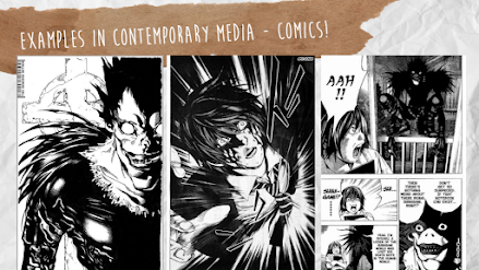
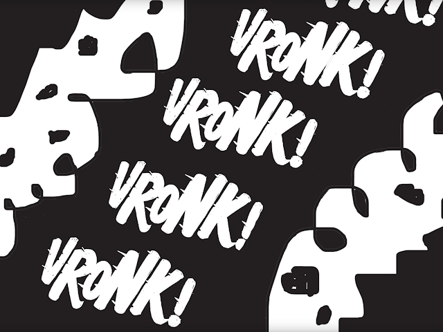
Onomatopoeia is another way to support motion, emotion, and expression into a line drawing which is very commonly used in renowned and good comics. With good font sizing, distortion, and the use of good typography, they can define the motions and emotions more precisely. All these can also be used to demonstrate the sound effects to make the story more interesting.
Figure 10.2: Demonstration of onomatopoeia
Another very interesting factor is by using the connection of photography to tell a good story. There can be many effects to be utilised such as blurred effect, long exposure, and blurred background to create a different view on the subjects in the photographic design. The knowledge of sequential photography is also very useful which is called "chronophotography".
Figure 10.3: Demonstration of Eadward Muybridge's chronophotography (1877)
Artists would utilise motion lines to demonstrate and convey motion characters. Some artists use thin lines and grade of details of the motion lines. Sometimes, motion lines can cover a span up to the entire page to represent a fast motion of the subject.
Other than that, we also use emoticons or pictograms to visualise how we feel or what we mean. Here are some examples: (feelings, collisions, explosions, and natural powers). They are used, to give more impact to the overall motion and emotion in the graphical frame itself. Other than that, we can utilise clouds, pebbles, stars, flames, smoke, twirls to create a simple illustrative meaning behind the composition itself so that viewers can understand the effect better even with speech bubbles or subtitles eliminated.
Figure 10.4: Demonstration of panels with good motion lines & symbols
Figure 10.5: Demonstration of panels with good motion lines & symbols
Figure 10.6: Demonstration of panels with good motion lines & symbols
Figure 10.7: Demonstration of panels with good motion lines & symbols
Weeks 11, 12, 13, 14
All the lecture sessions were already done up till week 10 and the following weeks were only held for consultation sessions. Therefore, there were no lectures documented in this post from this week onwards. The necessary feedback and reflections obtained for these weeks were documented in the post about task 3. (click here to view)















Comments
Post a Comment