Project 2: Shooting Practice & Editing
In this project, our entire class was split into 2 teams to cover 2 films which are 'BEEF' and 'SILENT'. I was assigned to Project S which is the 'SILENT' film and our team was tasked to distribute ourselves into a production crew each with our respective roles.
Producer : Jessica
Director : Amira
Assistant director 1:Fariha
Assistant director 2: Sorcha
Art director: Adrianna
D.O.P : Isaac
Cam Assistant 1: Akifredz
Cam Assistant 2: Cheng Yue
Lighting crew 1: Guang You
Lighting crew 2: Jia Rou
Boom: Marcus
Location sound: Elysa
Sound Assistant (extra): Alyssa
Actor 1: Kai Jin
Actor 2: Safia
Extra: Lim Jun Teng
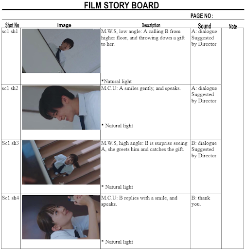
Here is the general storyline that was given, and our director shall suggest the dialogue for the scene. The goal is to replicate a section/short clip as the highlight of the film. Of course, we should follow all the rules of thumb when it comes to filming and handling the production of a shoot like this. The explanations of these filming, framing, camera settings, editing, and storytelling are explained in the progress sections below in this blog.
Figure 3. Breakdown of Production Settings and Props
With that, we went on with the filming of 'SILENT' and all the compilations behind the scenes are as shown below. The whole setup was an interesting one because we were given the opportunity to use the microphone, tripod, and lighting equipment from the University. I am glad that we could use the RODE microphone together with the audio interface which is a very professional setup whereas the camera used is the Fujifilm XT-4 with a Tamron 17-70mm F2.8 and a Viltrox 85mm F1.8 lens. The Tamron 17-70mm F2.8 zoom lens was used for scene 1 and scene 3 shots because the settings were all indoor, or locations that had limited spaces for a longer focal length lens to be used. As for scene 2, the Viltrox 85mm F1.8 lens was used because the setting was at a playground or an outdoor environment, allowing us to have more space to play around with.
Figure 4. Behind the Scenes of Project 2 Shooting
Figure 5. Camera Equipment (Left - Fujifilm XT-4), (Middle - Tamron 17-70mm F2.8), (Right - Viltrox 85mm F1.8)
Figure 6. Difference between Log and Normal Video
After shooting, we compiled all the videos and audios into a Google Drive folder and we began editing them. Here are some of the editing features/effects that I use to help me complete the editing process.
1. Color Grading
The lumetri scopes feature allowed me to denote the portions that are underexposed and overexposed so that I can balance out the color and also the brightness via exposure. In Figure 7, the top left is the luma waveform to denote to ensure the exposure is within range (suggested between 0 - 100). The top right is the RGB parade which is similar to the luma waveform, but to ensure no colors are overly exposed nor unbalanced in an extreme manner. As seen, I prefer my videos/pictures a little 'hot' or have a reddish tint to them. As for the bottom left and right, these are the vectorscope YUV and HLS respectively, to be used and ensure no colors exceed the suggested limit as it is displayed in the shape of a color wheel. This is because the further it is, away from the center of the circle, the more saturated the color is, which is not ideal if it is overly saturated.
2. Pop-Up Message
I key-framed the section where there is a pop-up message and used the motion, opacity, corner pin, and drop shadow effects to create this outcome.
Figure 8. Editing of Pop-Up Message
3. Denoise
I denoised all the audio by just a little to control the loudness of the background sounds until a sweet spot was obtained for every audio. This is because we want to hear the conversations clearly but also just a little bit of the background sound so that it sounds more realistic, and that we understand the scene they are in.
Figure 9. Denoise Effect
Here are the illustrations of before and after, in color grading for every scene. I tend to like the color teal more and make the video look a little 'hot', or reddish in color so that it will have a balance of the red saturated human skin tone color whereas the background has a colder look, representing a moody scene. As for the overall scenic and 'high quality' look that I am going for, I like to add more fade into my videos.Pictures (a) are only color-graded with the adjustment layer whereas pictures (b) are the ones color-graded with both the adjustment layer and the video itself.
After all the editing, color grading, using transitions, pop-up effects, shadow effects, key-framing, fade in and out, crossfade, film fade, denoise, adding title text, rolling credits, sound effects, background sound, and cutting, this is the timeline:
The exported video is as shown:
Figure 12. Final Outcome for Project 2
Project 2 Exercise 2 - TikTok/Instagram Reel Video
In this project, we were given the task to ideate, create, shoot, edit, and submit a vertical aspect ratio video that is about 1 minute long. There is no limit to the type of video theme we can go with, even the software to edit with. As for my approach, I want to fully utilize the Adobe Premiere Pro software that we have learned for this module. Figure 1 below shows the idea that I have for this project.
With that, I shot a scene in the university for the starting and ending scenes. The starting scene replicates the transition from my first day walking into Taylor's University and then transitioning to my last day. As for the last scene, I received a message to myself saying that I was preparing for the next chapter of my life.
The recorded videos were compiled into a folder and I also obtained some clips that were recorded in a vertical orientation so that it matches the aspect ratio of the Tik Tok video interface which is 9:16. All the clips are as shown in Figure 2.
This is the process of editing the different effects and the use of color grading for my video.
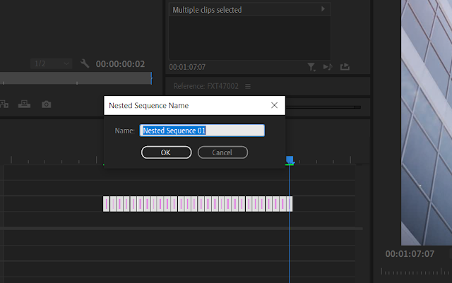
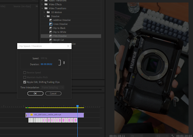
1. The first effect is to create a hyperlapse. I attached a list of frames taken as pictures after taking one step forward and repeating the shots until I get a smooth array of pictures. After putting all the frames in the timeline, I nested them into a sequence so it is taken as a singular clip. Then, I applied the warp stabilizer effect and played with the stabilization percentage until a sweet spot was achieved.
Figure 3. Editing for Hyperlapse
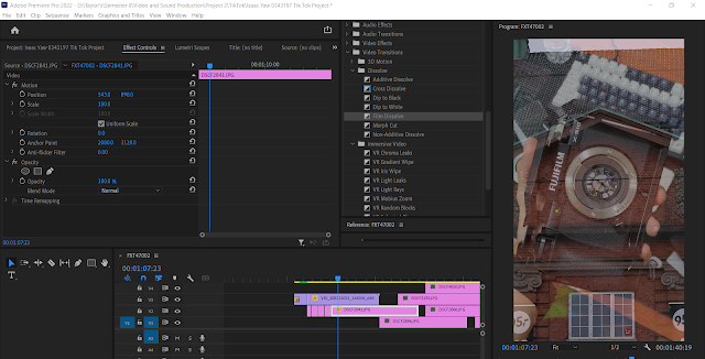
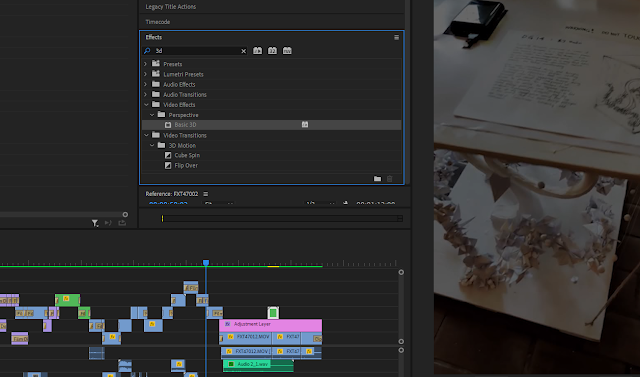
Figure 4. Editing for Circular Edit
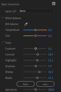
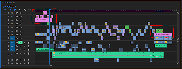
Then, I did the color grading according to my style and my liking. I would always take inspiration from Hollywood film colors as they are often edited to have very high quality alongside having very high lighting to complement the subject and the background. However, there was a huge challenge because I have compiled a folder of many different clips from the past and the colors are very inconsistent since they were recorded on my phone and they are often more edited and look more processed with higher color tones. Since the clips of the scenes in University were recorded on my camera and the settings were set at F-LOG, I will only add adjustment layers to these scenes as shown in the layers highlighted in red in Figure 6.
Figure 7. Color Grading Settings from the Adjustment Layer
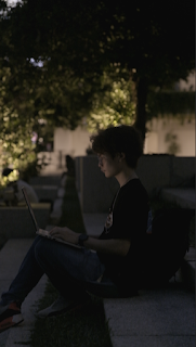
Figure 8. Comparison Before and After Color Grading
The final outcome is shown below:
Figure 9. Final Outcome for Project 2 Exercise 2
Feedback:
Mr. Martin gave some feedback in week 9's class session where I showed my first draft. In the comments, my video is too messy and there are too many transitions that made some parts of the clips a little hard to understand and view. My concern was that the video had to be within 1 minute duration and my first draft was 58 seconds long. He advised that the video can be longer and it is suggested to remove some clips if I think they are not too important to be included. After further editing, my final video is 1 minute and 12 seconds long.
Reflection:
I felt that this assignment/project was a huge test of my creativity because I felt that I managed to learn the necessary skills to master video editing (of course there is still a lot of room for improvement), but requires a lot of trial and error to see whichever works better than one another. Therefore, I learned a lot in terms of video visualization and design planning before wasting too much time trying the video editing first and then only figuring out whether the clips would fit one another or not. In other words, I learned to do more pre-planning and organizing things to improve in my projects from the planning, to the post production stage.






 (a)
(a)











Comments
Post a Comment