Design Principles Week 1
-August 24, 2021
NAME: Isaac Yaw Wai Zac
I.D: 0343197
COURSE: Bachelor of Engineering (Honours) Mechanical
Engineering
SECTION: 02
In this week’s classes, the module lecturer, Miss Jinchi
welcomed all the students from different schools and gave a short briefing
about how the classes will be conducted. Under the briefing and introduction to
the module, the module information booklet (MIB) was introduced, and its
importance was emphasized.
The topics introduced this week were 1.1 and 1.2:
Topic 1.1: Elements
and Principles of Design
Elements:
1. Point
-The simplest element of design which is represented by dots and the combination of repetitive marks will form a line that can be used in many creative 2- and 3-dimensional forms.
Topic 1.2: Gestalt
theory and Contrast
Under this topic, I learned about the importance of contrast which allows more visual understanding whilst having very nice visuals in the composition of an image or design poster. As a photographer myself, this is a very important aspect when it comes to photography because having contrast can bring in more meaning and draw people's attention into looking at the image, which also applies to visual designs. Other than that, I also learned about the Gestalt theory that refers to the terms 'shape' or 'form'. This theory allows me to further understand about the concept of reducing the complexity of a very complex design by merging or composing the repetitive or large quantity of elements to a more simple form. Of course, this aspect is very important because nobody would be interested to look at complex designs that do not portray any meaningful elements or stories.
Other than that, there were a few other principles such as similarity, continuation, closure, proximity, figure, and symmetry. These principles are the design features that makeup and represent a design.
The task (Exercise 1) was introduced and is due in week 3 due
to the holiday assigned in week 2’s class. Exercise 1 requires us to create 2 designs, one about Gestalt theory and another one about Contrast.
Design process:
-Visual research
When doing research, the main platform used is Pinterest because there are many different and creative artworks to get inspiration from. However, I could not copy those available examples and this made the experience a lot harder. In the Gestalt theory research, most of the designs are in black and white and they include a lot of faces to be embedded into other objects such as vases, or other irregular surfaces. In the contrast design, it can be seen that most of the artworks have very colourful elements to contrast between one with another.
Figure 2.1: Examples of Gestalt theory designs available on the Internet (28th August 2021)
Figure 2.2: Examples of Contrast designs available on the Internet (28th August 2021)
-Idea exploration and description
The sketches shown down are the very rough drafts and ideas I had in the initial stages. However, further researches were done to further finalise my design ideas for both the Gestalt theory design and also Contrast design.
https://drive.google.com/file/d/1yArva-TvRCWUQsj7SqZtu8QdicVCUctn/view?usp=sharing
In the ideation stage for creating the Gestalt theory design, I initially went with a horror theme such as integrating elements such as toxic elements, skulls, and weapons. All the examples are shown in Figures 2.3, 2.4, and 2.5. However, I thought about something easier to be implemented which is using the radioactive symbol and some of the shapes can represent other elements with similar shapes. TO replace the radioactive logo with similarly shaped objects, I went with my favourite food, pizza to replace the 'pie shaped' elements and the top view of a soda can to replace the center circular element.
Figure 2.3: Example of horror Gestalt theory design (28th August 2021)
Figure 2.5: Example of horror Gestalt theory design (28th August 2021)
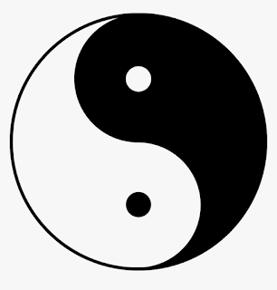
In the ideation stage of creating the Contrast design, the inspiration came from the concept of 'Yin-Yang' as shown in Figure 2.7 but it should be done with a nicer touch. In the research for the Gestalt theory design, I came across the design using a lightbulb as shown in Figure 2.8 and I thought that it could be integrated into the Contrast design. To contrast 2 very different objects whilst look alike is pretty hard to think about. However, I think that a grenade resembles the shape of a lightbulb and it could bring a different meaning to the design and will be further explained in the 'Final outcome' section below.
Figure 2.8: Inspiration for creating the Contrast design (object)-(28th August 2021)
In the first draft of the Gestalt design, I manage to implement the radioactive logo to represent danger but in a cute way. which is to signal 'HUNGRY' as an important message showing 'I am Hungry!'. I am very happy with how the final outcome turned out because it fits the Gestalt Theory theme whilst being very cute. This design is related to/obey the Gestalt's law of figure/ground and closure.
In the first draft of the Contrast design, the use of only black and white elements was done because the colour spectrum of these 2 colours are the total opposite and therefore, will collectively bring huge contrast to the 2 elements in the design which are the lightbulb and grenade. This design is entitled 'BOOMING IDEAS'.
-Lecturer’s Feedback
In the third week, Miss Jinchi assessed all our work individually and a few comments were given for each of my designs. For the Gestalt theory design, the overall theme is more related to the combination of fast food and signifies poor health. She suggested that the colour scheme can be further worked on because it should show the danger of the overall theme instead of making it look appetising. The use of the word 'HUNGRY' can also be worked on to deliver the message in a better way. Other than that, she suggested that this design fits more on the principle of closure instead of the principle of figure/ground because of the missing pizza slices.
For the contrast design, Miss Jinchi liked the idea of it but the design should be more balanced in terms of the size between the bulb and also the grenade because the handle of the grenade makes it look relatively larger than that of the lightbulb. She suggested that light rays can be placed so that both sides will look more similar in terms of size.
-Final Outcome
The changes were made to the first drafts of both Gestalt theory and Contrast designs after getting feedbacks from Miss Jinchi. For the Gestalt theory design, it is entitled 'HUNGRY?' to show or give awareness about the danger of fast food to all viewers. To further match the theme, the use of black and yellow colour scheme was used, similar to the original radioactive sign so that it enhances the danger of consuming fast food towards our health. The question mark (?) was added to the word 'HUNGRY' to show that it is a message to viewers to think twice before consuming these unhealthy food and drinks.
-Reflection
This assignment/exercise is definitely a challenging one because we had to come up with our own creative ideas to turn it into digital art whilst meeting the requirements under this given topic. This very first exercise taught me how to use the Adobe Illustrator software and I am glad that I am improving in digital art design and it will be very helpful for my upcoming tasks and exercises. This module also taught me how to set up and organise a blog which is a very new thing to me as I have never used or publish one before this.


Comments
Post a Comment